UI Extensions
UI Extensions allow you to add custom interface elements to NovelAI. These extensions can appear in various locations and provide interactive controls for your scripts. They are set through the function api.v1.ui.register and if given IDs can be updated through api.v1.ui.update. You can also use api.v1.ui.update to add new extensions as long as an ID is provided.
All extensions are defined as objects with a type property that specifies the kind of extension it is. Each type has its own set of properties that define its behavior and appearance. Many extensions can contain UI Parts to define their content. For more information on UI Parts please see the UI Parts documentation.
Extension Types
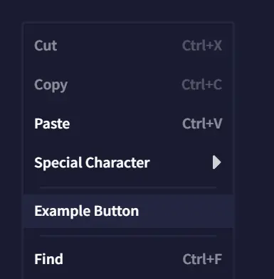
Context Menu Buttons
These appear in the context menu that appears when right clicking in the editor. Its callback is provided the current selection in the document.
Example:
api.v1.ui.register([
  {
    type: 'contextMenuButton',
    text: 'Example Button',
    callback: () => {
      api.v1.log('Example context menu button clicked.')
    }
  }
])
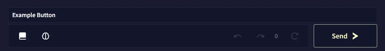
Toolbar Buttons
Toolbar Buttons appear in a new toolbar above the normal editor toolbar. This bar is reserved for scripts to place these buttons.
Example:
api.v1.ui.register([
  {
    type: 'toolbarButton',
    text: 'Example Button',
    callback: () => {
      api.v1.log('Example toolbar button clicked.')
    }
  }
])
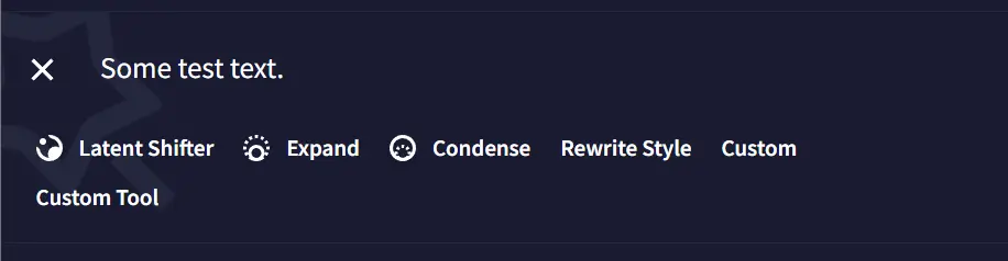
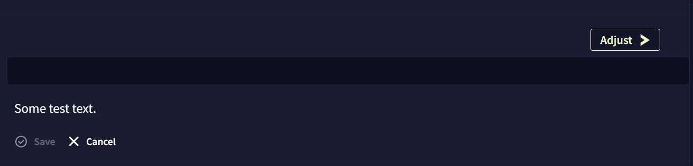
Toolbox Options
This extension type adds an option to the Writer’s Toolbox. Script-added options appear below the normal selection. It’s callback is called when the user clicks the “Adjust” button when the tool is selected. The toolbox option’s callback is provided the text selected for the tool and the selection in the document and string returned by the callback will be treated as the modified text. It has a content field that can be used to provide custom UI Parts to be displayed in the toolbox when the tool is selected.
Example:
api.v1.ui.register([
  {
    type: 'toolboxOption',
    name: 'Custom Tool',
    content: [
      {
        type: 'textInput',
        storageKey: 'tool-input',
      }
    ],
    callback: ({ text }) => {
      api.v1.log('Custom tool executed.')
      return { text: text + ' New text.' }
    }
  }
])
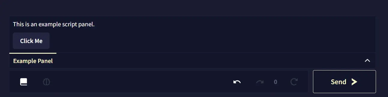
Script Panels
Script Panels are added between the document the the controls. They are collapsible panels that can contain arbitrary UI content defined using UI Parts. Only one panel can be open at a time.
Example:
api.v1.ui.register([
  {
    type: 'scriptPanel',
    name: 'Example Panel',
    content: [
      {
        type: 'text',
        text: 'This is an example script panel.'
      },
      {
        type: 'button',
        text: 'Click Me',
        callback: () => {
          api.v1.log('Button in script panel clicked.')
        }
      }
    ]
  }
])
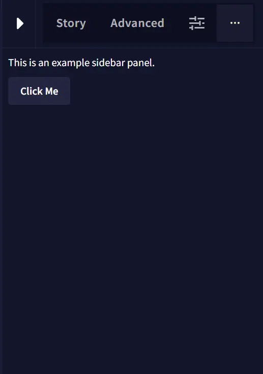
Sidebar Panels
Sidebar Panels are added to the right sidebar when a story is open to a new ”…” tab. Like Script Panels they can contain arbitrary UI content defined using UI Parts. If multiple Sidebar Panels are registered they will appear as tabs in the sidebar.
Example:
api.v1.ui.register([
  {
    type: 'sidebarPanel',
    name: 'Example Sidebar',
    content: [
      {
        type: 'text',
        text: 'This is an example sidebar panel.'
      },
      {
        type: 'button',
        text: 'Click Me',
        callback: () => {
          api.v1.log('Button in sidebar panel clicked.')
        }
      }
    ]
  }
])
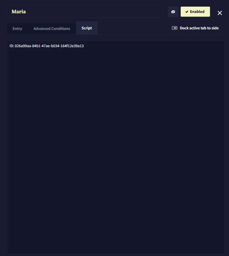
Lorebook Panels
Lorebook Panels appear in the “Script” tab of Lorebook entries and categories. If multiple Lorebook Panels are registered they will appear as tabs within the “Script” tab. They can contain arbitrary UI content defined using UI Parts. If you want them to have content specific to the selected entry or category, you can render it inside of the onLorebookEntrySelected hook.
Example:
api.v1.hooks.register('onLorebookEntrySelected', async ({ entryId, categoryId }) => {
  api.v1.ui.update([{
    type: "lorebookPanel",
    id: 'lore-info-panel',
    content: [
      {
        type: 'text',
        text: `ID: ${entryId ?? categoryId}`
      }
    ]
  }])
})
See Also
- UI Parts Reference - Building blocks for UI content
- Hooks - Responding to lorebook selection events
- Lorebook API - Working with lorebook entries
- API Reference - Complete API documentation